Re-optimizing search functions for Medscape
Role: UX Researcher | Team: Esther Kim, Todd Wu, Scott Dunay, Ellen Mahoney, Lynn Zhang
Project Overview
For this project, we were tasked with evaluating search functions across Medscape.com, specifically relating to the global site search, drugs & diseases search, as well as use of filters.
Our team conducted a thorough evaluation of Medscape’s website using the Moderated User Testing method. The primary goal was to conduct a usability evaluation of the search experience on Medscape.com and offer recommendations for improving the search results page. Following the evaluation, our team created three recommendation proposals to address the main issues identified during our research:
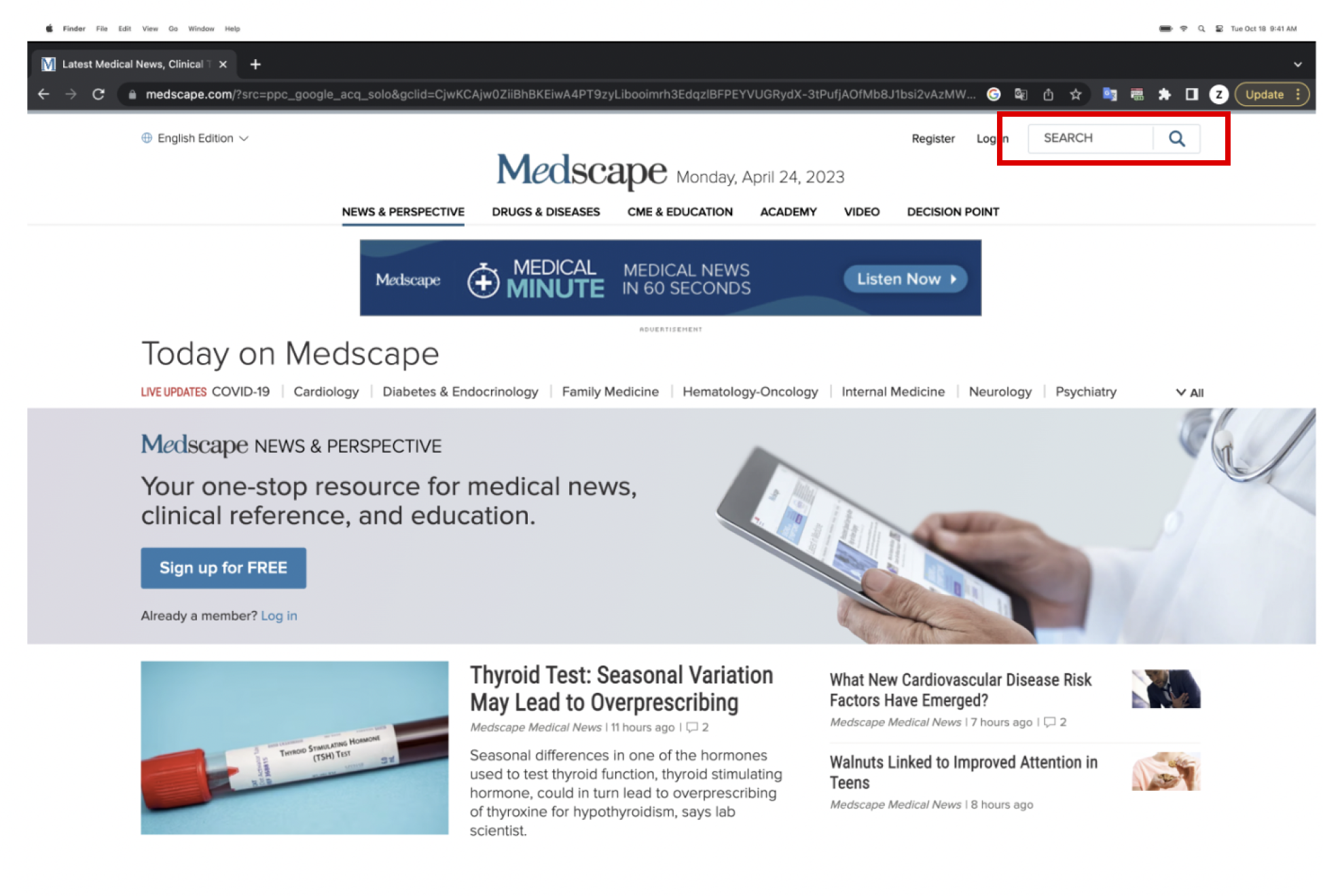
Increase Search Bar's prominence with the integration of a filter button.
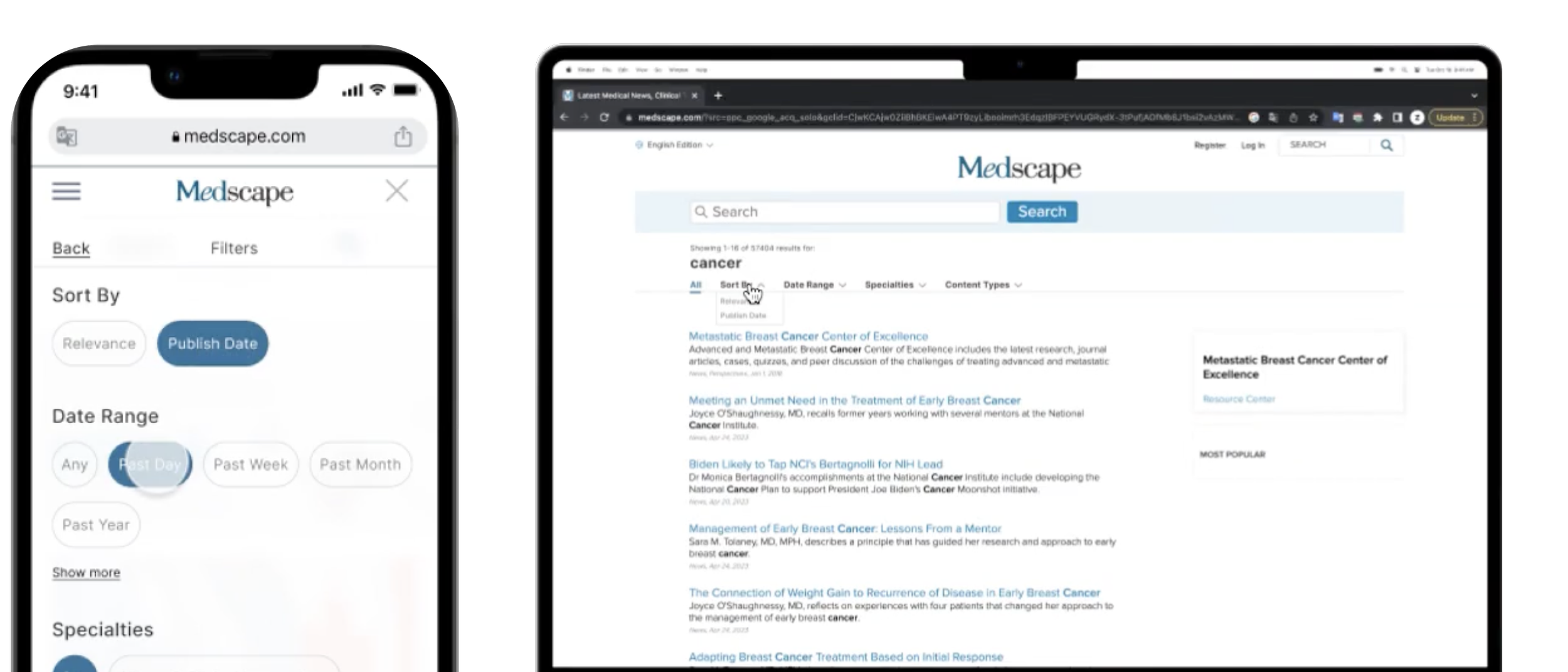
Streamline filter options on the Search Results page.
Include intuitive language and signals on the Drug Interaction Checker page.
Research Phase - Methodology
The usability study for Medscape.com utilized the Moderated User Test method to assess the effectiveness of users in performing specific tasks.
During each testing session, we presented each participant with a total of 3 scenarios, each with a corresponding task to complete, within a controlled laboratory environment. Participants were asked to “think aloud” while completing their tasks, so that we as researchers could better understand their thought process and identify key issues listed below.
Research Phase - Participant Recruitment
For participant recruitment, we consulted with Hannah Goldstrow, the Director of Design/UX at Medscape.com, and reviewed the information she provided to us in order to determine the following target users (within the US):
Physicians
Registered nurses
Pharmacists
Other health professionals
We initially used a screening questionnaire to cull through potential participants, and once we had our final participants, we began our testing sessions.
Key Findings
Our participants generally had a very high success rate for all tasks, and found that the Medscape interface was intuitive in terms of its overall design. However, after analyzing all of our data, we noted 3 common frustrations expressed by a majority of the participants.
Main Problems:
Design Recommendations
Based off of the frustrations / problems listed above, our team compiled 3 design recommendations to improve users’ experiences with Medscape.com. We collectively brainstormed what might be the best design solutions for these issues, then created mockups to present to our clients.
Recommendation 1: Make the global search bar more prominent and enable filtering from the beginning of the search
[Figure 1 - Current search bar]
[Figure 3 - Current search result page (cluttered, disorganized layout)]
[Figure 2 - Recommended Search bar w/ filter options]
Recommendation 2: Streamline the filtering options on the search results page
[Figure 4 - Recommended search result page w/ clear filter options]
Recommendation 3: Include more intuitive language and signals on the drug interaction checker page
[Figure 5 - Current drug interaction search result page)]
[Figure 6 - Recommended drug interaction page]
Importance of Pilot Interviews:
During this project, I realized the vitality of running pilot interviews prior to meeting with the actual participants. Doing so reveals the flaws or holes in your interview that you might not have noticed otherwise
Embracing awkward silences:
While conducting these user interviews,
I noticed how much valuable information comes out of sitting through “awkward silences”. Allowing space for silences helps participants to reflect on and vocalize insights/actions that might have been passed by if silence was not given.
Potential next steps:
If our team were to continue with this project, our next steps would be to user test and evaluate whether our recommendations were able to solve the issues at hand. We would also consider running our tests with a demographic that is less familiar with Medscape.


